Creating Reusable GUI Elements
In this tutorial, we describe how to make a TabWidget that can be reused as a general-purpose widget.
Contents
The End Result
Starting from the end - how the user would like to use the TabWidget - is a good way to drive good encapsulation and to avoid forcing implementation details upon the end user.
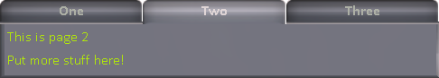
You should have an image of what the final result will look like, and a feel for how it would be used. If you’re reproducing concepts that already exist, you can use existing art as a guide. Here, we just cheat and show a picture of the end result:
Now, from the coding side, how would we like to use our TabWidget?
1. “Import” the functionality into our script
The implementation is all contained in the single “TabWidget” directory. This allows us to easily share the implementation with multiple KSP installs, and with others online:
RUNONCEPATH("TabWidget/tabwidget").
2. Create a GUI
Our TabWidget should be usable in any context, but in this example, we just create it at the top-level. The AddTabWidget function should however accept any VBOX as the parameter:
LOCAL my_gui IS GUI(500).
LOCAL tabwidget IS AddTabWidget(my_gui).
3. Add tabs
We will want a function that adds a tab with a title on it, and returns a box into which we can put whatever widgets we want:
LOCAL page IS AddTab(tabwidget,"One").
page:ADDLABEL("This is page 1").
page:ADDLABEL("Put stuff here!").

LOCAL page IS AddTab(tabwidget,"Two").
page:ADDLABEL("This is page 2").
page:ADDLABEL("Put more stuff here!").

LOCAL page IS AddTab(tabwidget,"Three").
page:ADDLABEL("This is page 3").
page:ADDLABEL("Put even stuff here!").
4. Choose tab programmatically
Sometimes we might want a tab other than the first to be the one shown. For example, the first tab might be for launching into orbit from the surface, but if the vessel reboots and finds itself in space, the tab for setting up Maneuver Nodes might be a better default:
ChooseTab(tabwidget,1).
5. Handling the widgets on the tabs
The rest here is just boilerplate - we add a Close button to the top level, then show and run the GUI until the user presses the Close button:
LOCAL close IS my_gui:ADDBUTTON("Close").
my_gui:SHOW().
UNTIL close:PRESSED {
    // Handle processing of all the widgets on all the tabs.
    WAIT(0).
}
my_gui:HIDE().
The Implementation
We now move on to the implementation of this desired functionality. We put everything below in the “TabWidget/tabwidget.ks” file, as suggested in the RUNONCEPATH above.
1. Creating the TabWidget
First, we implement the required “AddTabWidget” function. This function takes any box as a parameter (eg. the top level GUI, or one created by GUI:ADDVLAYOUT, GUI:ADDSCROLLBOX, etc.:
DECLARE FUNCTION AddTabWidget
{
        // Any box is allowed
        DECLARE PARAMETER box.

        // See if styles for the TabWidget components (tabs and panels) has
        // already been defined elsewhere. If not, define each one

        IF NOT box:GUI:SKIN:HAS("TabWidgetTab") {

                // The style for tabs is like a button, but it should smoothly connect
                // to the panel below it, especially if it is the current selected tab.

                LOCAL style IS box:GUI:SKIN:ADD("TabWidgetTab",box:GUI:SKIN:BUTTON).

                // Images are stored alongside the code.
                SET style:BG TO "TabWidget/images/back".
                SET style:ON:BG to "TabWidget/images/front".
                // Tweak the style.
                SET style:TEXTCOLOR TO RGBA(0.7,0.75,0.7,1).
                SET style:HOVER:BG TO "".
                SET style:HOVER_ON:BG TO "".
                SET style:MARGIN:H TO 0.
                SET style:MARGIN:BOTTOM TO 0.
        }
        IF NOT box:GUI:SKIN:HAS("TabWidgetPanel") {
                LOCAL style IS box:GUI:SKIN:ADD("TabWidgetPanel",box:GUI:SKIN:WINDOW).
                SET style:BG TO "TabWidget/images/panel".
                SET style:PADDING:TOP to 0.
        }

        // Add a vlayout (in case the box is a HBOX, for example),
        // then add a hlayout for the tabs and a stack to hols all the panels.
        LOCAL vbox IS box:ADDVLAYOUT.
        LOCAL tabs IS vbox:ADDHLAYOUT.
        LOCAL panels IS vbox:ADDSTACK.

        // any other customization of tabs and panels goes here

        // Return the empty TabWidget.
        RETURN vbox.
}
2. Images for the Tabs and Panels
The images are based on other elements to make them suit the style.
The tab when in front: |
|
Based on Button normal state |
The tab when in the back |
|
Based on Button normal_on state |
The panel below the tabs: |
|
Based on the GUI window background |


Note that these images need to be in the “TabWidget/images” directory, as referred to in the code above.
3. Adding a Tab
Next, we implement the required “AddTab” function. This function takes a TabWidget created by the previous function and adds another tab to the end with a given name. It returns a VBOX into which widgets for that page of the TabWidget can be added.:
DECLARE FUNCTION AddTab
{
        DECLARE PARAMETER tabwidget. // (the vbox)
        DECLARE PARAMETER tabname. // title for the tab

        // Get back the two widgets we created in AddTabWidget
        LOCAL hboxes IS tabwidget:WIDGETS.
        LOCAL tabs IS hboxes[0]. // the HLAYOUT
        LOCAL panels IS hboxes[1]. // the STACK

        // Add another panel, style it correctly
        LOCAL panel IS panels:ADDVBOX.
        SET panel:STYLE TO panel:GUI:SKIN:GET("TabWidgetPanel").

        // Add another tab, style it correctly
        LOCAL tab IS tabs:ADDBUTTON(tabname).
        SET tab:STYLE TO tab:GUI:SKIN:GET("TabWidgetTab").

        // Set the tab button to be exclusive - when
        // one tab goes up, the others go down.
        SET tab:TOGGLE TO true.
        SET tab:EXCLUSIVE TO true.

        // If this is the first tab, make it start already shown (make the tab presssed)
        // Otherwise, we hide it (even though the STACK will only show the first anyway,
        // but by keeping everything "correct", we can be a little more efficient later.
        IF panels:WIDGETS:LENGTH = 1 {
                SET tab:PRESSED TO true.
                panels:SHOWONLY(panel).
        } else {
                panel:HIDE().
        }


        // Add the tab and its corresponding panel to global variables,
        // in order to handle interaction later.
        TabWidget_alltabs:ADD(tab).
        TabWidget_allpanels:ADD(panel).

        RETURN panel.
}

// Global variables to allow interaction to be done later.
GLOBAL TabWidget_alltabs TO LIST().
GLOBAL TabWidget_allpanels TO LIST().
3. Adding a Tab
We want to be able to choose a specific tab to be shown, so we add a simple function to encapsulate that:
DECLARE FUNCTION ChooseTab
{
        DECLARE PARAMETER tabwidget. // The tab
        DECLARE PARAMETER tabnum. // Which tab to choose (0 is first)
        // Find the tabs hlayout - is is the first of the two we added
        LOCAL hboxes IS tabwidget:WIDGETS.
        LOCAL tabs IS hboxes[0].
        // Find the tab, and set it to be pressed
        SET tabs:WIDGETS[tabnum]:PRESSED TO true.
}
4. Running the TabWidget
Rather than ask the user to repeatedly call a function to run the TabWidget (which would also be fine, but not in our original design), we instead use a “trick” to watch the tab buttons to see if they get pressed, and raise the corresponding tab if they are:
WHEN True THEN {
        FROM { LOCAL x IS 0.} UNTIL x >= TabWidget_alltabs:LENGTH STEP { SET x TO x+1.} DO
        {
                // Earlier, we were careful to hide the panels that were not the current
                // one when they were added, so we can test if the panel is VISIBLE
                // to avoid the more expensive call to SHOWONLY every frame.
                IF TabWidget_alltabs[x]:PRESSED AND NOT TabWidget_allpanels[x]:VISIBLE {
                        TabWidget_allpanels[x]:parent:showonly(TabWidget_allpanels[x]).
                }
        }
        PRESERVE.
}
By using “WHEN True” and “PRESERVE”, this code effectively runs once every frame. It looks at all the tabs that have been created (even in multiple TabWidgets), and calls SHOWONLY on the STACK, giving it the panel that corresponds to the tab that was pressed. Since this code is executed every frame (but only once, since RUNONCEPATH ensures this WHEN statement only starts once), we are careful to do the minimum amount of processing necessary.
5. Testing with Communication Delay
When playing with communication delay enabled (eg. with RemoteTech), you will want to ensure that the GUI is still usable with interaction delays, and ensure it does not cause continuous communication on the link. For example, if you constantly show a label with very high precision decimal, it will probably be updating the label continuously, which would mean the communication delay icon is constantly shown. We can test our GUI without flying to Jool by artificially adding extra delay, and testing on the launch pad:
...
SET my_gui:EXTRADELAY TO 2.
...
The widget continues to work perfectly. Even if the user rapidly changes tab, the pages change as expected, though of course delayed.